Skincare designed to magnify our natural beauty
Branding
Content
Creative Direction
Design
Film
Strategy
Tone of Voice
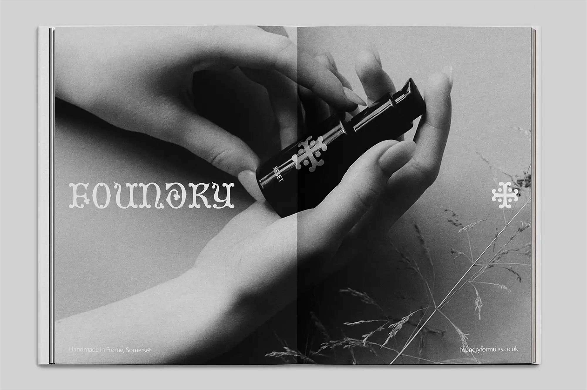
Foundry is a British skincare and beauty brand born in Somerset whose purpose is to uplift the senses and magnify the natural beauty in us all. The Foundry leadership team asked us to help them define their brand strategy and create a visual identity that feels grounded, contemporary and crafted.
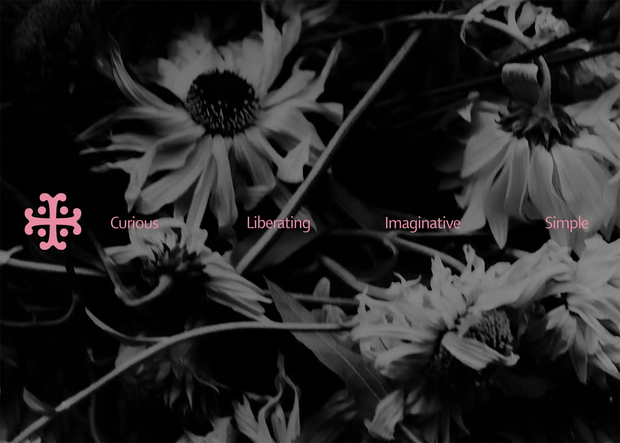
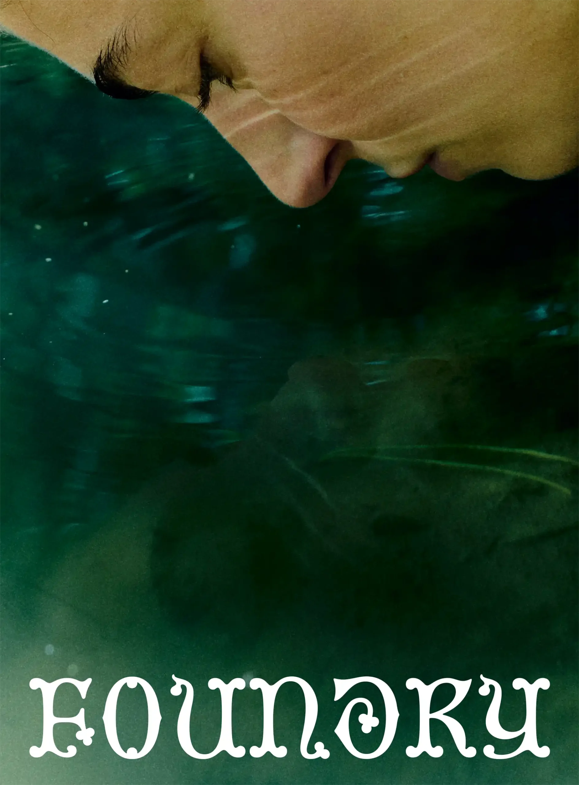
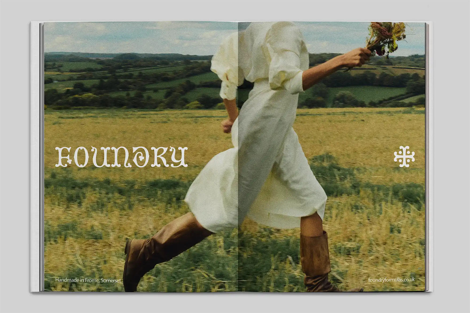
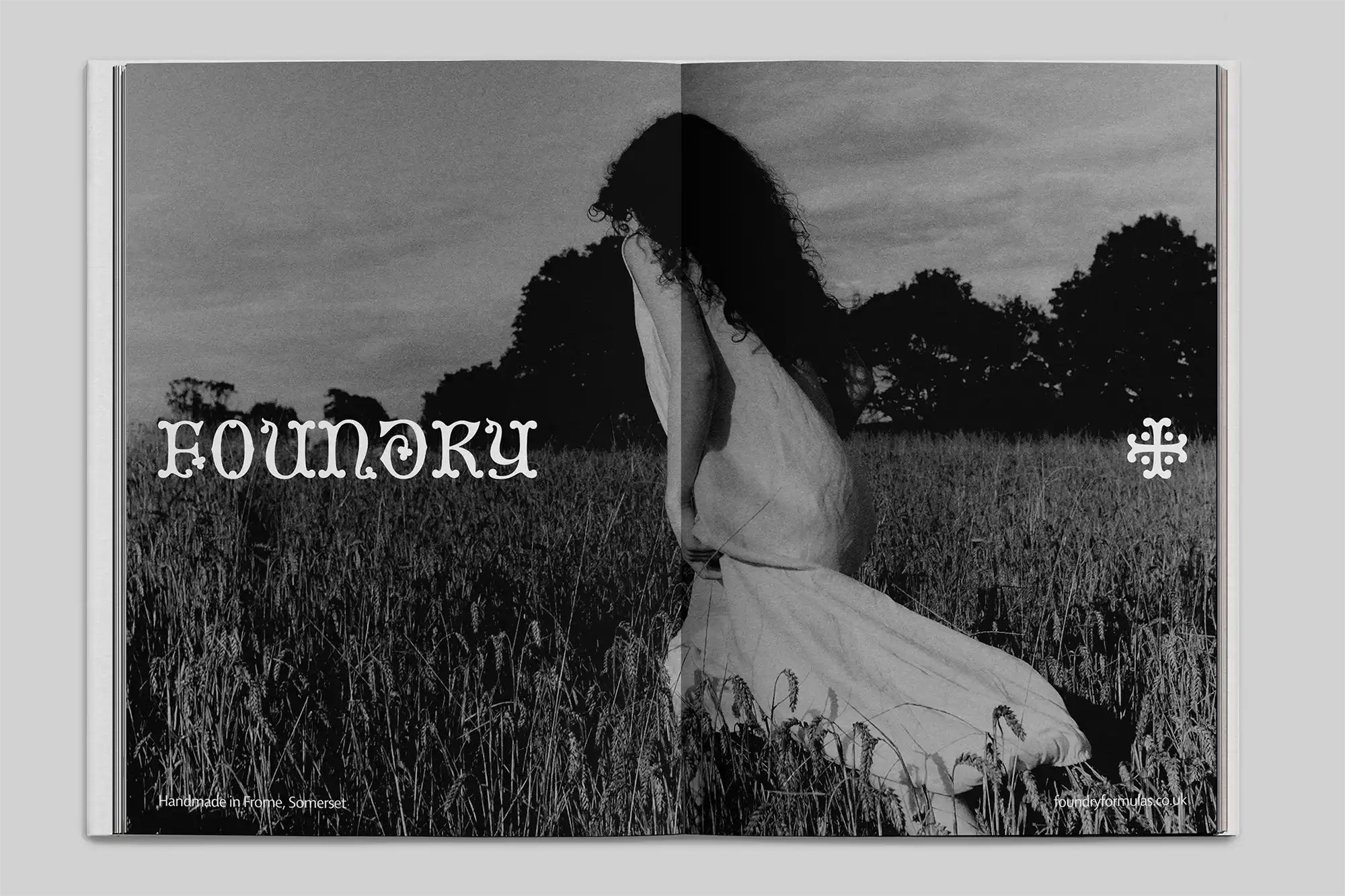
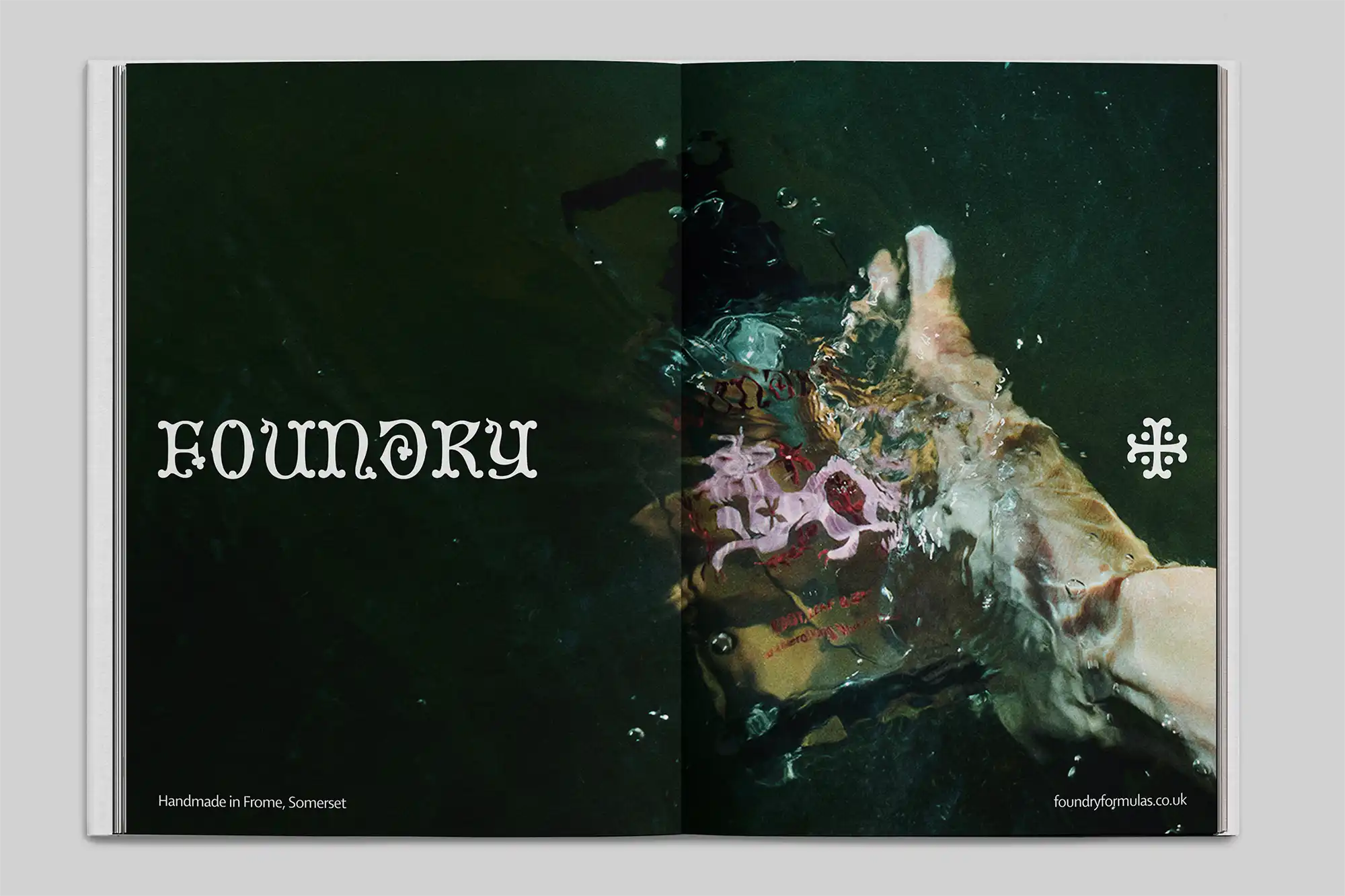
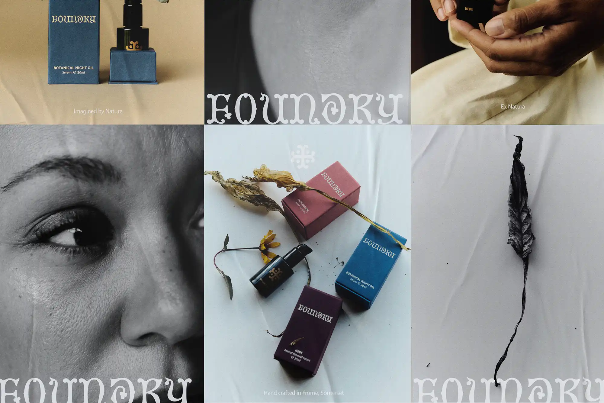
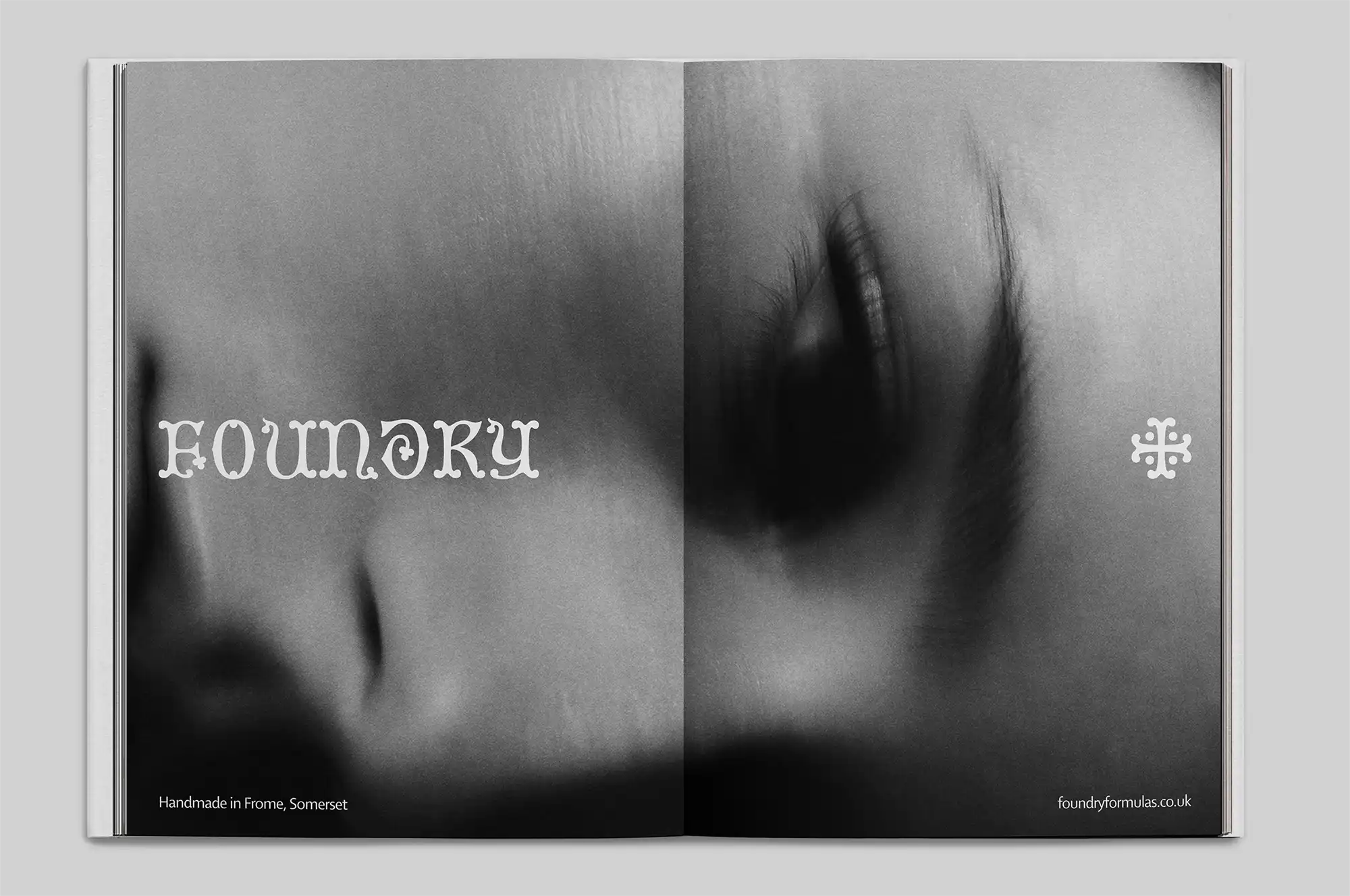
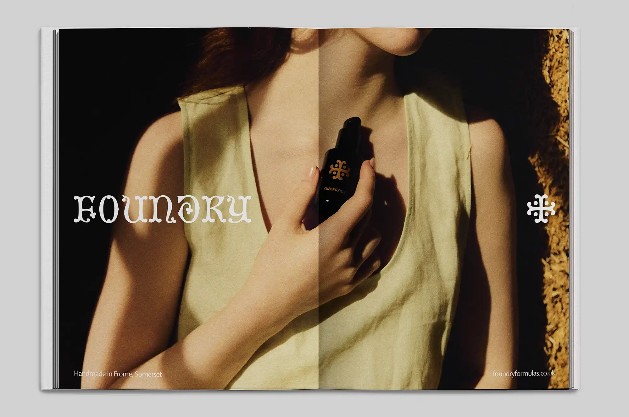
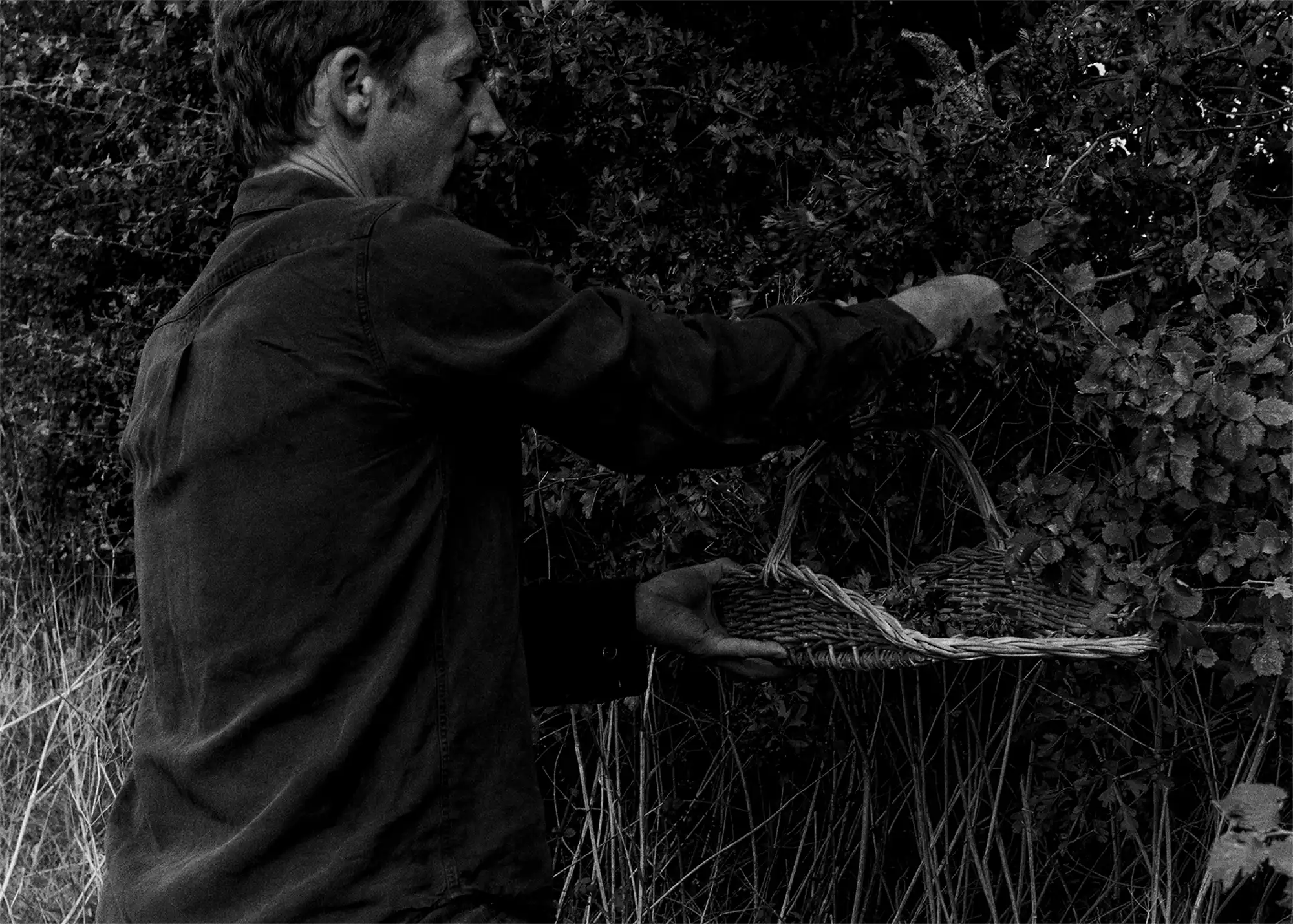
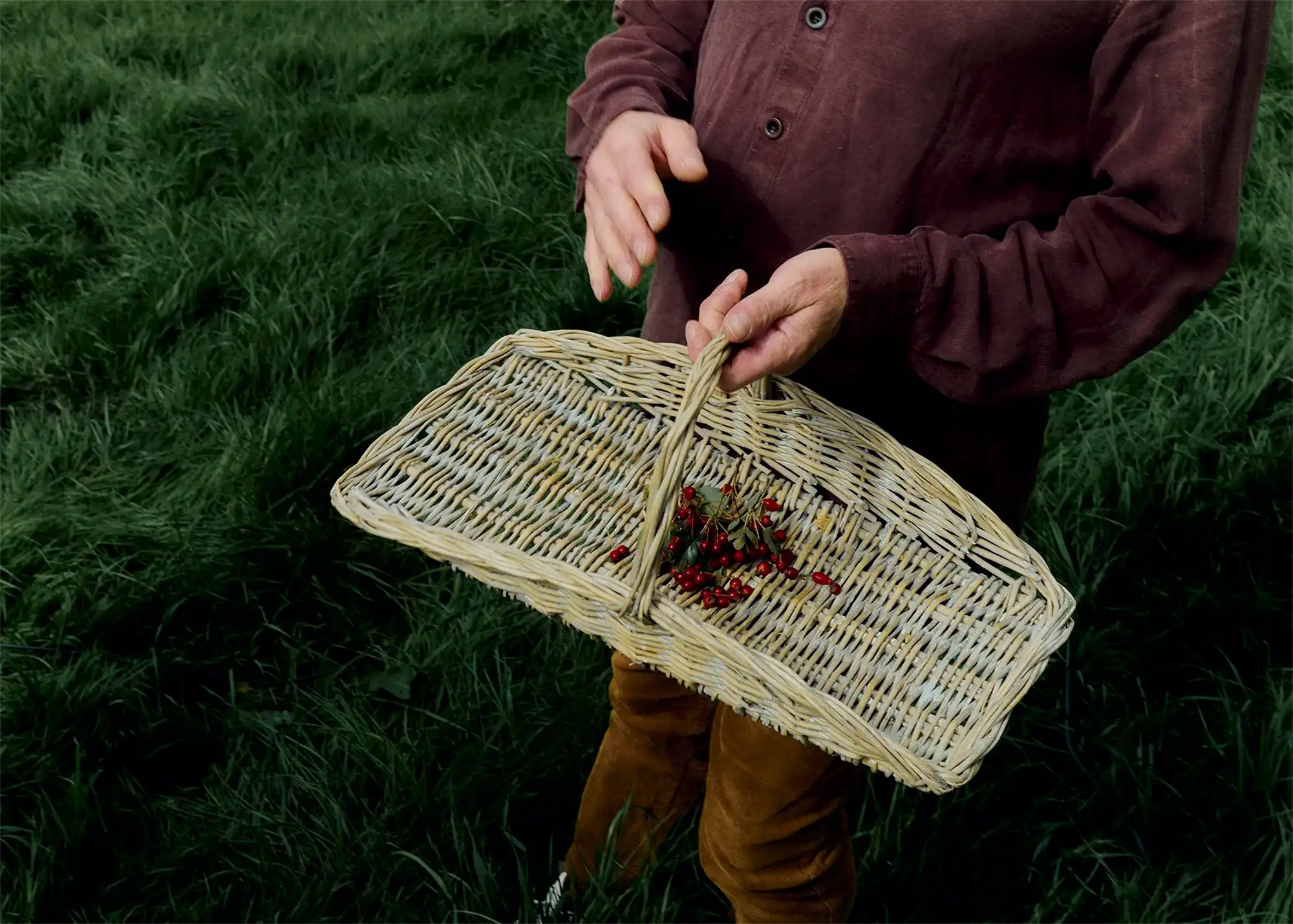
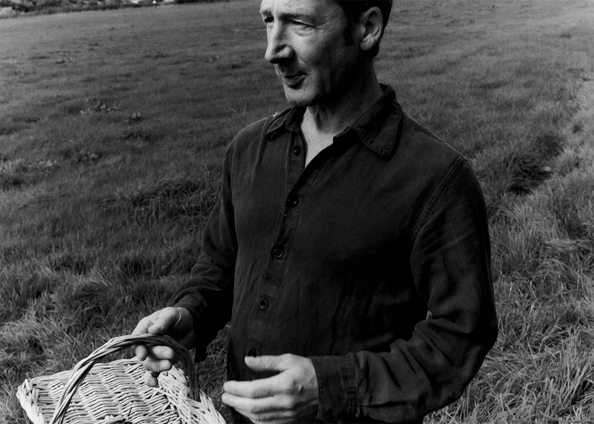
The inspiration for the visual identity began with a 15th-century ornamental alphabet we discovered in an old book; the wordmark and letterforms carrying a sense of history, tactility, craft and nature. Organic shapes and remarkable serif details echo the brand’s natural surroundings and the foraged ingredients lovingly blended into each formulation. To accompany the wordmark, we developed a distinctive typographic cross, adapted from the original typeface and refined into the Foundry Crossmark – reminiscent of a makers mark, to bring a layer of authenticity to the identity.

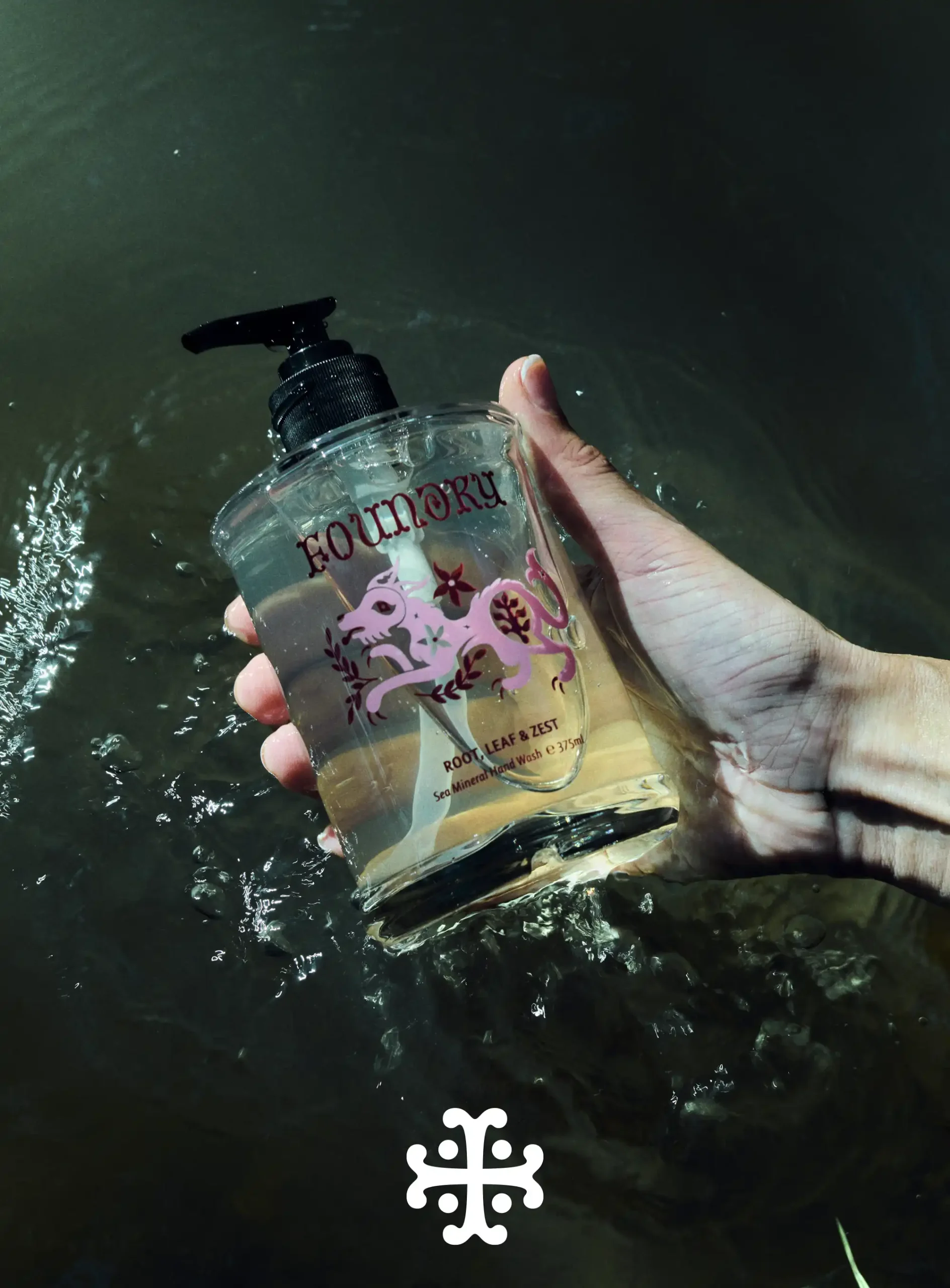
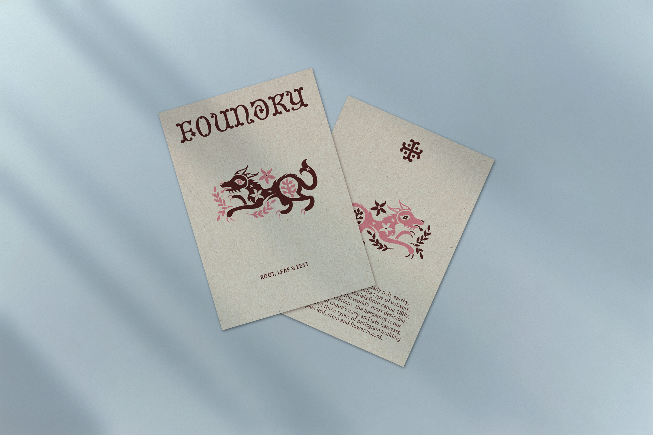
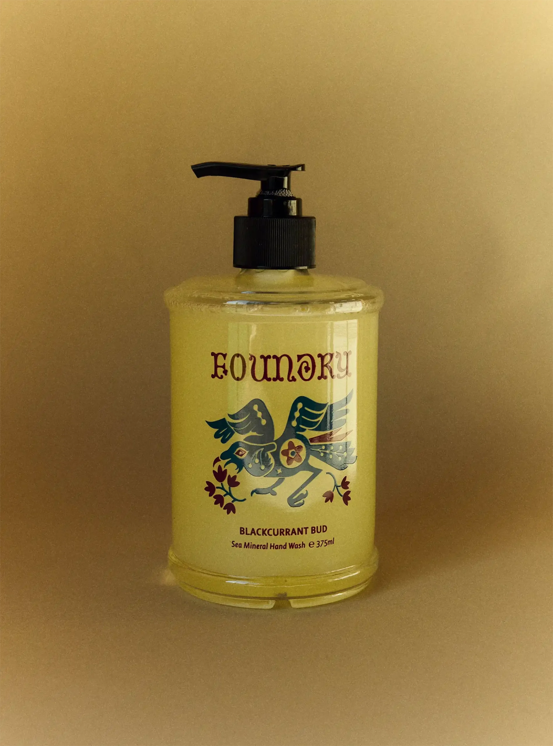
Following on from the identity concept, we designed the packaging system, discovering along the way the need for a series of iconic, artistic illustrations for their hand wash and hand cream product icons. Working closely with illustrator Joel Lardner, we developed illustrations of four animals close to founder John’s heart, each found on the island on which Foundry products are made: a dog, a raven, a beaver and a hare.
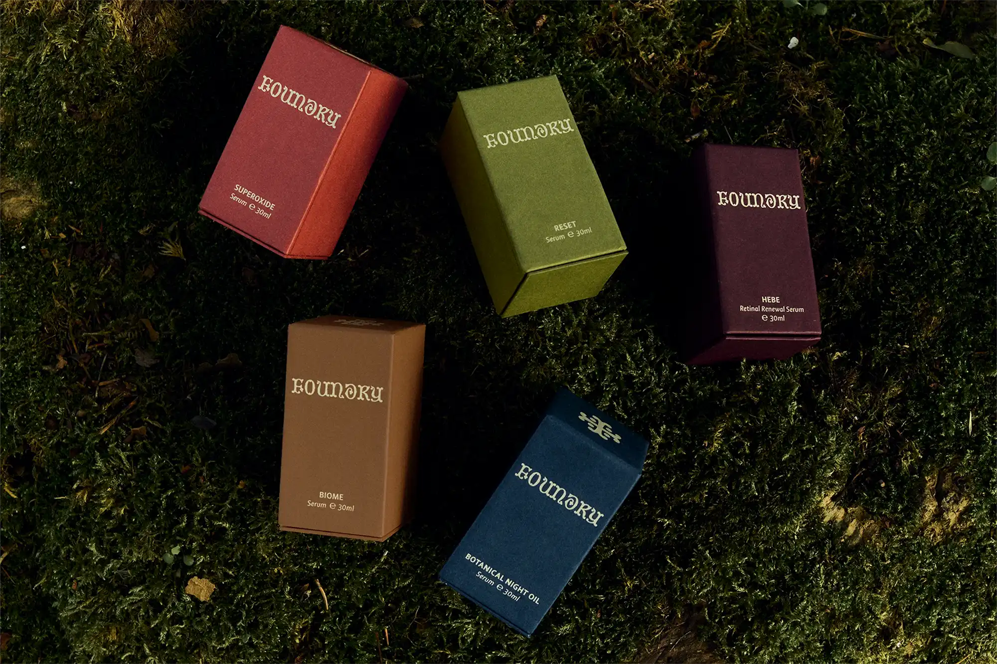
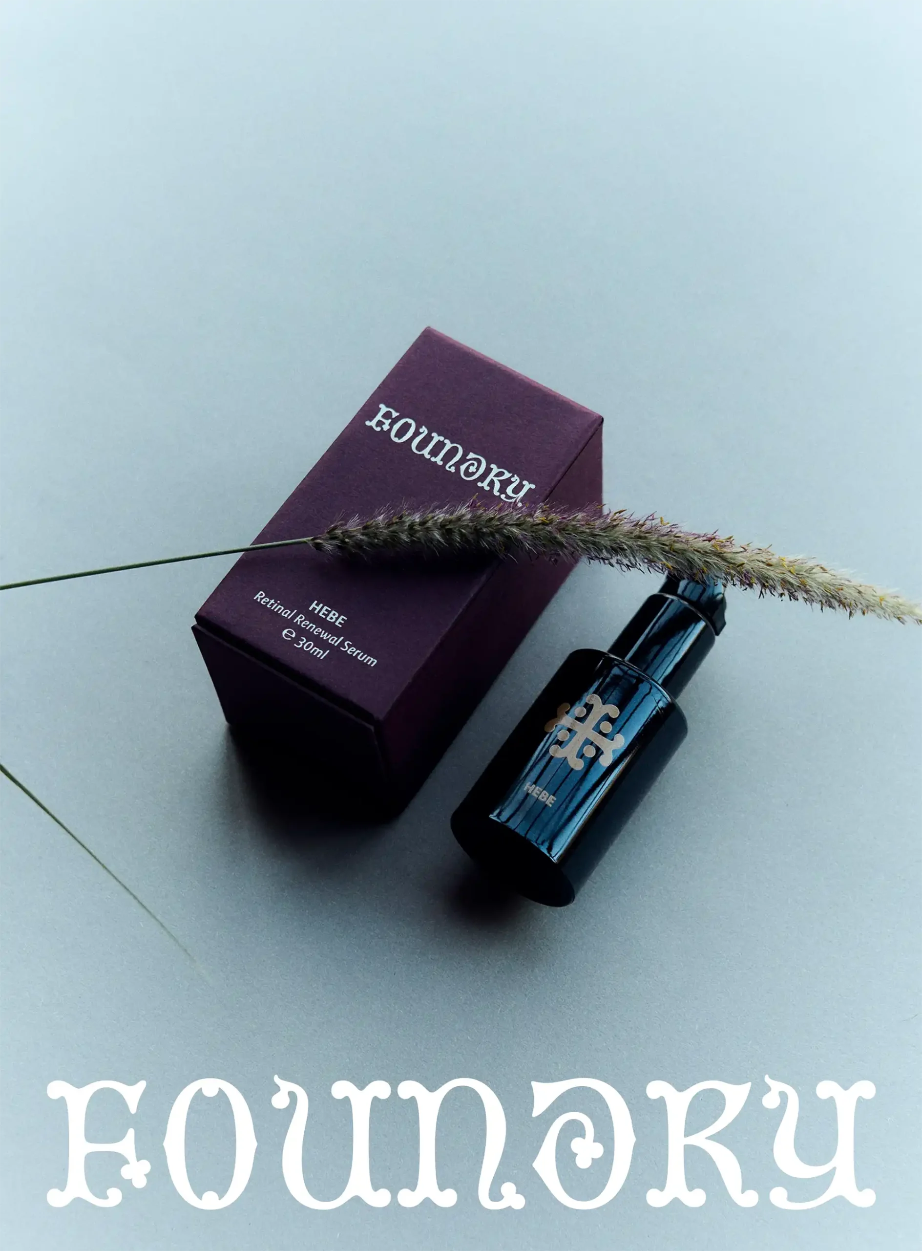
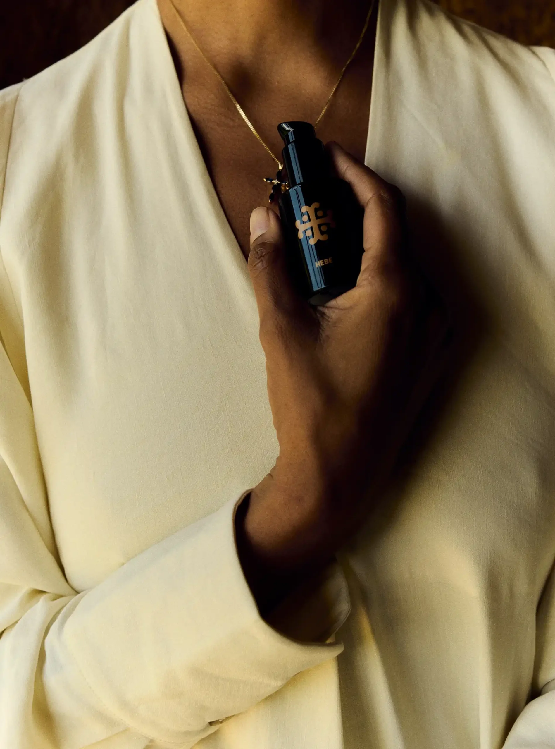
Adopting a simple approach to packaging design supports a product hierarchy where limited edition products feature in bottle printed glass with the illustrations, and rigid, coloured paper boxes for serums add a luxurious, sensorial tone, where each serum bottle is elegantly printed with the Crossmark and serum name. The colour palette and natural textures feel considered and provide differing packaging and unboxing experiences.
“What you and the team have helped us bring to life has inspired us and given us so much confidence and belief. The entire brand, the packaging and the creative look so happy and confident; we are creating something original here and you've managed to capture that, not follow or imitate others, just really distinctive. ”
John Kilroy, Founder
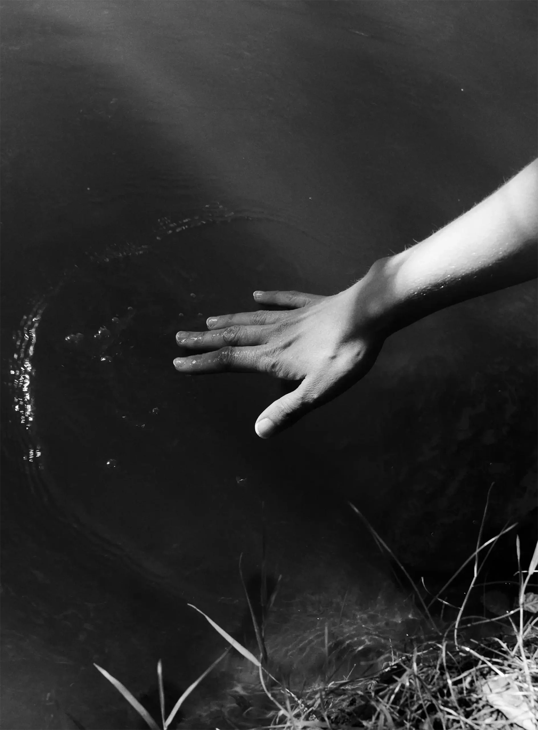
The website design is a visual system balancing softness and structure to create a digital experience where brand, storytelling and commercial touch-points intersect to create a series of rich, structured and simple customer journeys. The site design needed to feel as grounded and intentional as the products themseleves.
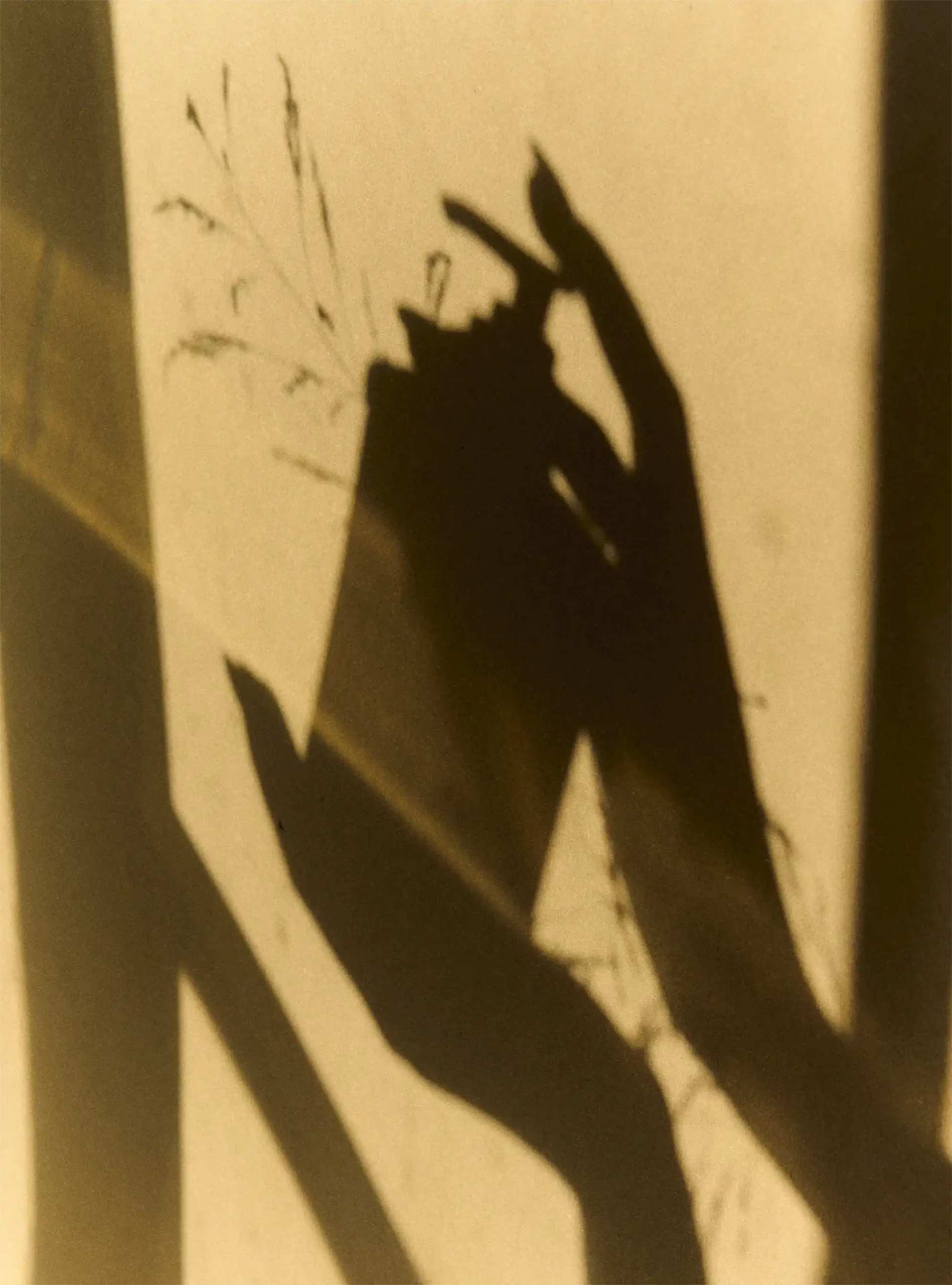
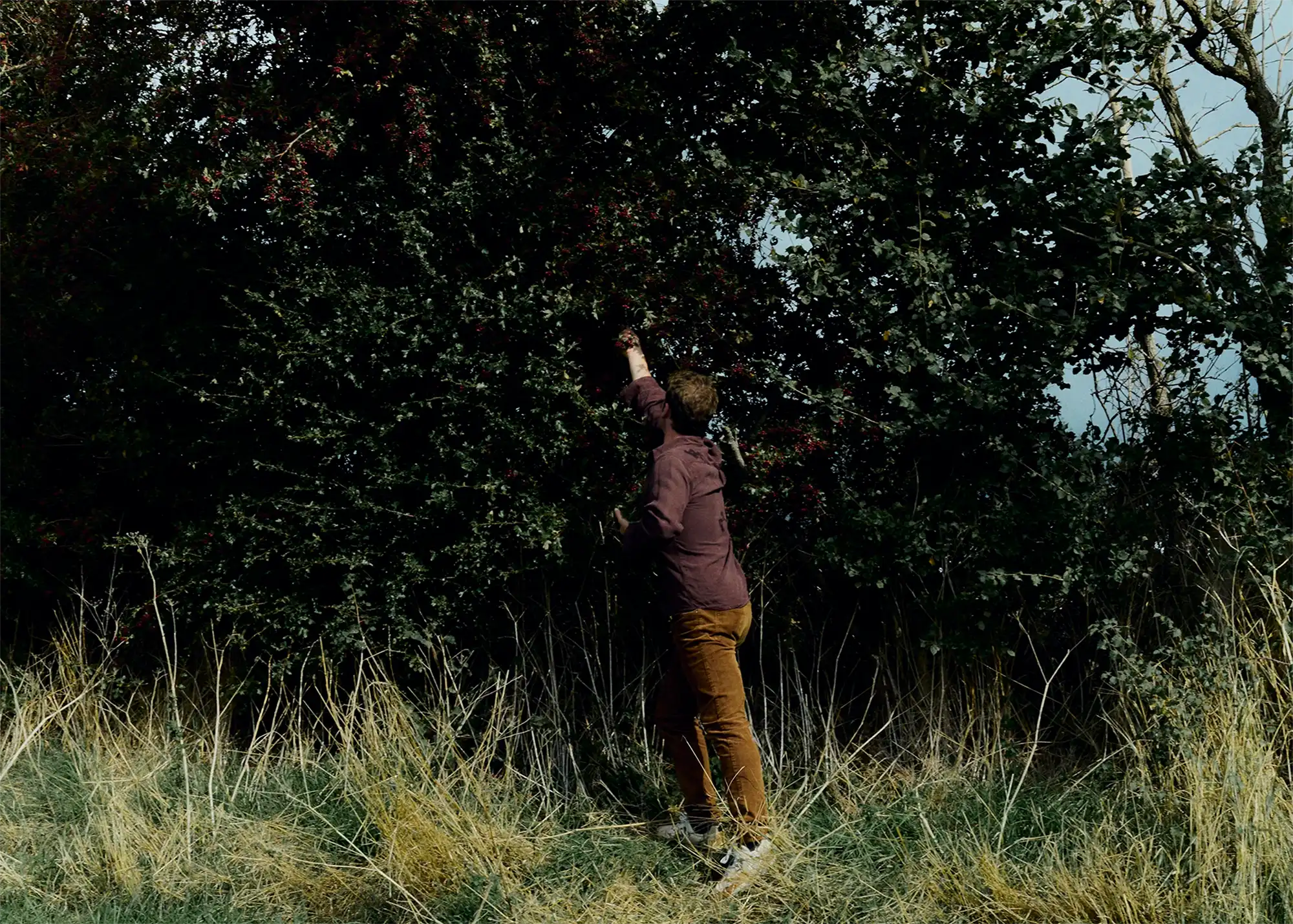
Foundry’s creative direction is guided by its positioning, and its personality — Curious, Liberating, Imaginative and Simple — ensuring every touchpoint feels calm, elevated and intentional, encouraging moments of pause, care and sensory connections to nature.

Other Stories
We’ve assembled a small selection of projects that show how clear strategic thinking and experience innovation can accelerate transformation, move people and help create life-long connections.